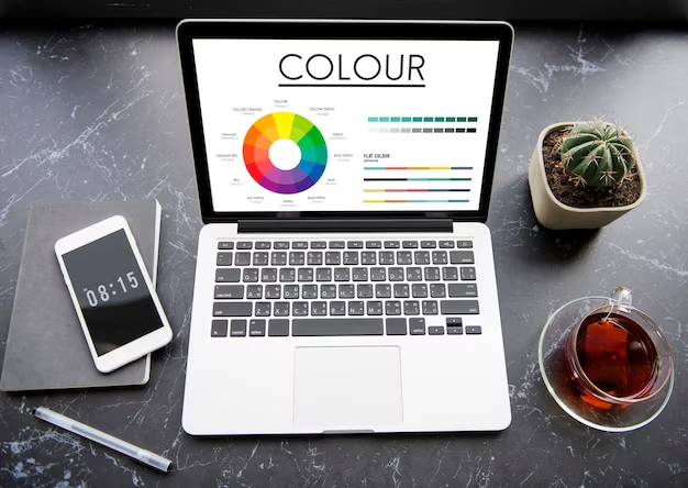
Why is color important in website design?
Selecting the right colors for your website is vital for your online success. You can utilize colors to stimulate your visitor’s emotions or prompt them to respond to a call-to-action on your website.
Color encourages us to remember images better than colorless (black and white) images; this can boost brand recognition and motivate visitors to take action on your website. Our judgment is influenced by color schemes at a subconscious level, so it’s important to ensure that your color palette aligns with your brand’s philosophy.

Create a Harmonious Color Palette
A well-designed website uses a harmonious color palette that blends seamlessly and creates a cohesive visual experience. Start by selecting a primary color that represents your brand identity. Then, choose secondary and accent colors that complement the primary color and create a visually pleasing contrast. Tools like Adobe Color or Colors can help you generate color schemes and ensure consistency across your website. A well-balanced palette not only enhances your site’s aesthetics but also guides user attention to key elements, creating a seamless and engaging experience.

How to Select the Right Colors for Your Website
Understanding color theory is important, but applying it to create a successful color palette requires a different approach. Here are some simple steps to guide you:
- Branding: If you have an existing business, start with your brand colors and then think of new colors to incorporate to complement your brand.
- Audience: The colors you use must also express the emotions that your business aims to communicate. Identify your target demographics and research the colors that resonate with them.
- Trend: Staying aware of color trends can give you fresh insights that make your design feel current and appealing.
- Emotional: Analyze what sort of emotion you want to elicit in your audience when they land on your website
- Balance: Explore color harmonies and consider the dominant color when selecting a color palette. Start with the dominant color and then layer your palette. Darker colors tend to attract attention and carry more visual weight, while lighter colors can be introduced to create depth and balance.

Common Mistakes to Avoid
1. Overusing Bright Colors
While bright colors can grab attention, overusing them can make your site feel overwhelming or unprofessional. Use them sparingly for accents or CTAs.
2. Ignoring Neutral Colors
Neutral colors like white, gray, and black play a crucial role in balancing your palette. They provide a clean background that allows your primary colors to stand out.
3. Using Trendy Colors Without Thought
Just because a color is trendy doesn’t mean it’s right for your brand. Always prioritize what aligns with your identity and audience.
4. Lack of Consistency
Inconsistent use of colors across pages can confuse users and dilute your brand. Stick to a defined color scheme throughout your site.

Colors are a powerful tool in web design that can influence user perceptions, emotions, and actions. By understanding color psychology, creating a harmonious color palette, considering branding and target audience, using colors strategically, maintaining consistency, and ensuring accessibility, you can effectively communicate your brand message and create an engaging user experience on your website. At Seerox, we specialize in web development services and can help you design a visually stunning website that captivates your audience with the right choice of colors.
Contact us today to discuss your web development needs!


